Wednesday, April 27, 2016

Final Video Project


https://vimeo.com/164509074


For my final project I chose to do a video of myself mixing paint to match the colors of fruit. I chose to mix the colors to match both the outside and inside of each fruit I used. 


Tuesday, March 1, 2016

Final Vibrating Edges

This is still close to my original, but I have changed some of the circles around and gotten rid of others to make it less cluttered.

Wednesday, February 17, 2016

Vibrating Edges


The idea of creating a psychedelic pattern was something I was always interested in, so finally being able to make one was very exciting for me. I chose blue-green and red-orange because I thought they would be the best to demonstrate vibrating edges. For the background I chose an ombre to show more depth in the image and make it more visually appealing.

Thursday, February 11, 2016

Color Wheel

I found this color wheel intimidating. I always considered myself good at mixing colors, but this seemed to prove me wrong. I struggled the most when it came to making the blue violet and the green yellow. The blue violet always seemed to either have too much blue or too much violet while my green yellow always looked too much like my pure green.

Monochromatic Painting


I really enjoyed working on this painting, even though it was very tedious.
I chose magenta as my hue because I believed it was the best to show the chroma of magenta. The painting shows how deep and intense magenta can be, but also how light and soft.

Monday, February 8, 2016

Munsell Charts


 When I was first introduced to the Munsell Color Charts I was very eager to get started. The moment I saw them I thought they were so aesthetically pleasing that I couldn't wait to have them all completed. 
Before doing this exercise I felt very confident in my ability to identify different hues and chroma. After doing this exercise I discovered I have a difficulty identifying and organizing blues and violets. The two just mesh together for me and become almost impossible for me to differentiate which is which. I struggled the most with 5PB so much to the point where I had to give up on it for a bit and then go back to it.

Colin Christian's Use of Color

Trigger Warning :


Gore/Body Horror


                                "Hidden" 2016 Fiberglass

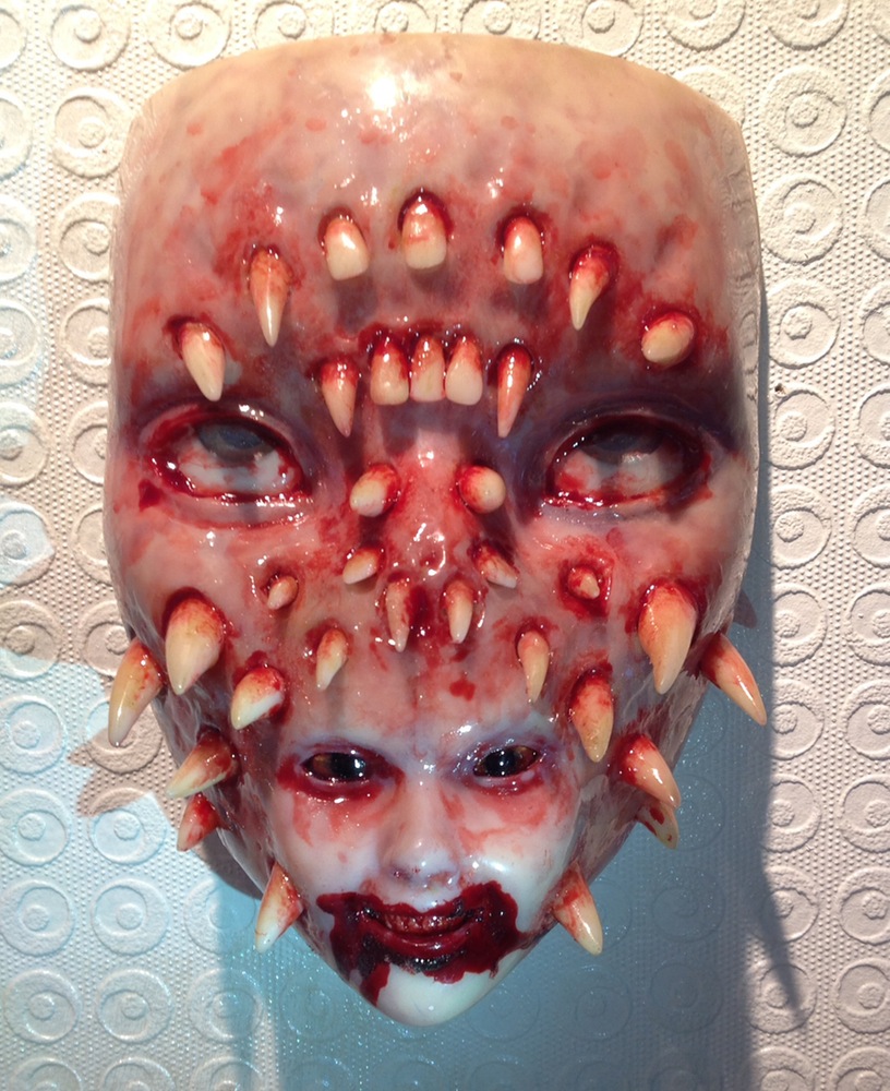
"Trypophobia" 2015 Fiberglass


As a Fine Arts Major I find myself mostly interested in the obscure and grim side of art. I lean more towards artist that are not afraid to scare their viewers, or make them uncomfortable. With that, Colin Christian is one of my favorite artists. He is a constant inspiration for me and always finds a new way to grasp my attention with his work.

He commonly uses fleshy tones and reds to create his grotesque style. His use of these color gives an uncomfortable and unsettling feeling to all those who see his work. The colors being so natural make the art feel more alive and possible for it to be real.
In "Hidden" the paleness of the face directs your focus to the warm shades of red in the skull and around the eyes. Them being used against the paleness shows where the viewers main focus should be, but also does not take the attention away from the coolness in the eyes.
"Trypophobia" is one of the best examples of his more unsettling pieces. The uses of different shades of red bring out the dimension of the piece and make it more realistic. The multiple uses of the color compliment each other.